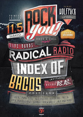
We all want audiences at our concerts, so we have to let people know about them.

I’ve seen so many bad examples of concert publicity recently, I thought I’d write a few tips.
This post is not an exhaustive dive into publicity design and different ways to publicise concerts. It’s just a quick look at some common mistakes and obvious things that need to be considered.
Most choirs will create a poster or flyer for their concerts. Non-professional choirs will almost certainly produce posters themselves, relying on skills of choir members.
The danger of this approach is that, unless those choir members have good design skills, the end product can also look non-professional. And worse, it might just not work as a piece of publicity.
vital information needed on posters
The most important elements that need to be incorporated are:
- where? – is the concert venue. Don’t assume local knowledge, so make sure the location is described accurately. Name and address.
- when? – is the concert: date, day of the week and time. Spell it out, not 23/09 for example.
- who? – is performing: mention the name of your choir if you have a large following.
- what? – is the content of the concert: classical, a cappella, world music, jazz, specific repertoire, etc.
- how? – can people book tickets and how much do they cost
It’s surprising how many posters lack some of these items. I’ve spent ages trying to find out where to book tickets. I’ve had to look on Google maps to get the correct address of a venue.
how to present the information visually
Once you’ve gathered this information you need to present it in an easily readable form with the most important things being prioritised.
Some posters have the choir name in huge letters (even though most average people have never heard of them), but venue and timings almost illegible at the bottom. Some posters have a full list of composers being performed, but very little space for important things like when the concert is.
Try to use no more than two different fonts in your design. Use large lettering and bold typeface for the most important information. Don’t get too visually cluttered: you might love the background image you’ve chosen, but it’s no good if it competes with the writing and people can’t read the information.
Run it by people who have no knowledge of what you do. Ask them what they understand from the poster. What is missing for them?
where is the publicity going to be seen?
Many choirs create a large poster design, then also print off the same design as a small flyer. The problem with this is that posters and flyers are doing different jobs.
A poster is usually out in the wild competing with loads of other visual information and clutter. Your design needs to be big, bold and clear. People need to be able to find the what, when and where very quickly.
A flyer will be in someone’s hand. They can take it home and read it at their leisure so it can be a little more subtle. However, it also has to have an attractive design or people won’t pick it up in the first place.
A big mistake is to simply copy the design of a large poster and make a small flyer of it. Font size can end up being too small, the design can look cluttered when squashed into the space of an A5 piece of paper. You may well want two designs: one for posters and the other for flyers. This can become expensive though, so it can be an idea to design the flyer first, then blow it up into a poster.
online versions of your poster will take time
Many of us use social media to promote our concerts. It’s tempting to simply use the poster image and post it online. However, each social media platform uses different sizes of images and can crop them in unexpected ways. Make sure you look up the specifications for each platform you use and test them first.
It may be that you have to design a variation of your poster to suit online needs. Keep to the same fonts, images and colour design, but maybe change layout or aspect ratio slightly.
Just posting an image is not guaranteed to present all the information you want. Make sure you add text to the post including the what, where and when even if it duplicates what’s in the image.
posters can’t do all the work on their own
I was taught that posters are simply a reminder of information that people have already encountered elsewhere. They can’t do the entire publicising job for you. You’ll need to back posters and flyers up with editorial in local newspapers, online articles, page on your website, social media campaign, etc.
don’t rest on your laurels
Just because publicity for one concert seemed to work quite well, doesn’t meant that you can just churn out the same thing for the next concert. Find out what worked. Ask audience members how they found out about the concert. Change things up each time and keep it fresh. Look at the local competition and how they publicise their concerts. Be different to them.
Good luck!
Chris Rowbury
Get more posts like this delivered straight to your inbox!
Click to subscribe by email.
… found this helpful?
I provide this content free of charge, because I like to be helpful. If you have found it useful, you may like to ...
... to say thank you.
